The Art of Color Theory: Guide for Animators, Designers & Artists

Hello artists, designers, and animators! Are you weary of feeling constrained by your color choices? Do you wish to produce aesthetically appealing works that capture your audience? Mastering color theory for beginners is the key to unleashing your creative potential and pushing your designs to the next level.
In this article, we’ll paint our way into the intriguing field of color theory for designers and animators. We’ll look at the science of color, how various colors may trigger different feelings and moods, and how to employ color combinations to create visually appealing images.
Whether you’re a seasoned expert or just starting out, this guide will provide you the skills you need to create outstanding designs that stand out from the crowd. From color harmonies to color psychology, we’ve got you covered. So, let’s dig in and discover the magic of color theory together!
The Science Of Color
Color is not just beautiful; it is also a science! Knowing the science of color can enable you to create designs that are both attractive and scientifically accurate.
The Visible Spectrum
This is the color spectrum that humans can see. These hues may be represented using three primary colors: red, green, and blue.
Color Models (RGB, CMYK, HSB)
If you wish to print your designs, you may utilize a separate CMYK model. The HSB model, which allows you to alter a color’s hue, saturation, and brightness, is commonly used in design applications.
The Difference between RGB and CMYK
We designers and animators will primarily work with RGB on our screens, but it’s important to remember that when dealing with colors, there are two color models: RGB and CMYK.
RGB stands for Red, Green, and Blue, creating colors using an additive color model. It is utilized in digital media, like websites, social media graphics, and videos.
The interesting thing about RGB is that it uses light to produce colors, so you can get bright and vivid colors that pop out on screen. Consider all of the brilliant colors you see on your favourite websites or in your favourite movies!
CMYK, on the other hand, stands for Cyan, Magenta, Yellow, and Key (Black) and uses a subtractive color system to produce colors. It’s commonly used for print material like brochures, flyers, and business cards.
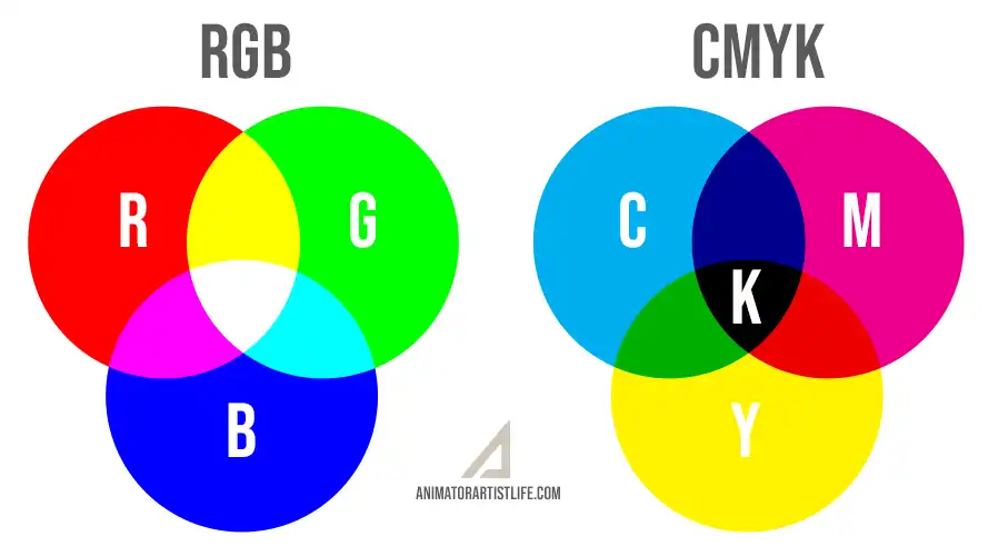
When CMYK colors are mixed together, they subtract from one another to produce various hues. Although the colors appear darker and less bright on paper, they might still look brilliant in print design.
Understanding the difference between RGB (additive color model) and CMYK (subtractive color model) may help you develop outstanding designs that look excellent on any medium, whether designing a bright and bold website or a lovely brochure!
“Understanding color theory is essential for designers and animators”
Color Perception
People see colors differently; some perceive colors more vividly than others. This is termed color blindness. Understanding how individuals perceive color will help you ensure that your designs are accessible to everyone.
Ultimately, understanding color theory is essential for designers and animators. Knowing how colors work and how people perceive them allows you to ensure that your designs look amazing and are easy to grasp for everyone.
Color Harmonies
Are you ready to explore the world of color combinations? Recognizing color harmonies is a terrific approach to ensure your designs look balanced and appealing. Let’s get started!
The Color Wheel
A color wheel is a helpful tool for understanding how various colors interact with one another. The color wheel may be used to find primary, secondary, and tertiary colors. ( See the image below )
Primary, secondary, and tertiary colors
Primary colors include red, blue, and yellow, whereas secondary colors are generated by combining two primary colors. Tertiary colors are created by combining primary and secondary hues

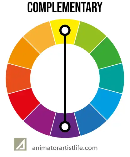
Complementary colors
are those that are opposite each other on the color wheel. Red and green are complementary colors and yellow and purple, for example.
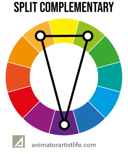
Split Complementary colors
This color combination works similarly to standard complimentary, it just uses more colors. Let’s say for example you choose the purple color, you then go to its complementary opposite and choose the colors adjacent. The whole color scheme is less vibrant but gives you a wider color palette.
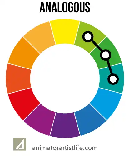
Analogous colors
are those that are adjacent to each other on the color wheel.
Triadic Colors
Triadic colors are groups of three colors uniformly distributed around the color wheel.

Tetradic Colors
Something for the more advanced color scientist! It utilises two complementary pairs to form a rectangle. It’s a little more difficult to harmonise but can yield beautiful visuals.

Color harmonies may help you develop eye-catching designs. For example, you may choose complimentary colors to produce a powerful, high-contrast appearance in your face, or similar colors to create a soft, harmonious sense.
Experimenting with different color combinations is a terrific method to discover what works best for your designs. Have fun with it, and don’t be scared to try new things!
Ultimately, recognizing color harmonies is a necessary skill for designers, artists, and animators. With some knowledge and experimentation, you can develop gorgeous designs that will wow your clients and give you a professional advantage. Our color theory knowledge is growing already!
Color Emphasis
Did you know that color may help you emphasize the most crucial aspects of your designs? Color, when used correctly, will bring people’s attention to where you want it to be. Here are some pointers to get you started
Create a Focal Point
Making a focal point is one technique to utilize color to emphasize. A focus point is the area of your design that you want people to notice initially.
You may draw attention to the focus point by utilizing a bright or contrasting color. For example, if you’re creating a concert poster, you may pick a bold hue for the band’s name.
Choose The Correct Color
Consider the colors you’ve previously used in your design. If you want your focus point to stand out, use a color that contrasts with the others. Choose a bright or vibrant hue that will stick out.
Build a Hierarchy
Another approach to use color to emphasize is to build a hierarchy. A hierarchy is a method of organizing information such that the essential information is at the top.
A clear hierarchy may be created by utilizing various colors for different levels of information.
For example, you may choose a bright color for the headline, a somewhat less brilliant color for the subheading, and a neutral color for the body content.
“color may help you emphasize the most crucial aspects of your designs”
Use a Color Pallette
Choose a few colors that go well together and utilize them consistently throughout your design. Employ brighter or more vivid colors for more significant information and more subdued or neutral hues for less critical information.
Set the Mood and Tone
Color may also be utilized to create mood and tone. Warm colors like red and orange, for example, might evoke feelings of excitement or energy, whereas cool colors like blue and green can evoke feelings of relaxation or serenity.
You may generate a more powerful and effective message by utilizing colors that complement the mood and tone of your design.
Ultimately, utilizing color to emphasize is an excellent tool for designers and animators. By intelligently employing color to create focal points, hierarchies, and mood, you can ensure that your designs are eye-catching and successful. So go ahead and experiment with other colors – the options are unlimited!
The Psychology of Color

Did you know that different colors may make you experience other emotions? It’s true! Color may influence your mood, emotions, and even your conduct. Let’s take a deeper look:
Warm vs. Cool: Colors are classified as either warm or cold. Bright colors like red, orange and yellow may make you feel cheerful, active, or even hungry (which is why so many fast food logos use red and yellow!). Cool hues like blue, green, and purple might make you feel peaceful, comfortable, or even melancholy.
Cultural Meanings
Colors Can Have Various Meanings in Different Cultures: Varying hues can have distinct connotations in different civilizations. For example, in Western civilizations, white is linked with purity and cleanliness, yet in certain Asian traditions, white is connected with death and grief. When designing for a worldwide audience, it is critical to be mindful of these cultural variances.
Colors can also mean different things to different people based on their own experiences and memories. For example, if you have a positive memory related to the color green, you may feel joyful or reassured when you see that hue. Pay attention to your own personal connections with different colors and utilize them to your advantage in your designs.
Knowing color psychology and its influence on the human brain may help you build designs that truly connect with your audience. You may develop designs with a strong impression by utilizing warm and cool colors, being mindful of cultural and personal connotations, and carefully selecting color combinations. So go ahead and play with color; you never know what type of emotional response you could elicit!
Color Combinations
Lastly, consider how different colors interact with your ideas. Certain color choices can generate a sense of harmony and balance, while others can clash and appear overbearing. Use the color wheel to help you select complementary colors.
Knowing color psychology and its influence on the human brain may help you build designs that truly connect with your audience. You may develop designs with a strong impression by utilizing warm and cool colors, being mindful of cultural and personal connotations, and carefully selecting color combinations. So go ahead and play with color; you never know what type of emotional response you could elicit!
Color in Design and Animation

Welcome to the fascinating field of color in design and animation! Color may be your hidden weapon as an artist, designer, or animator for generating eye-catching and successful graphics. These are some essential methods to incorporate color in your work:
Advertising and Branding
Color is an excellent approach to building a visual identity for a company or product. When selecting colors for a brand, consider the brand’s ideals and personality. For example, if the company is all about eco-friendliness and sustainability, you may choose colors green or blue.
Color is a vital tool for building brand awareness and setting the tone for your product or service. You may establish a distinctive and compelling visual identity by selecting colors that match your brand’s beliefs and personality.
Graphic Design
Color may also add hierarchy, contrast, and visual appeal to your designs. By utilizing various colors for distinct elements, you may lead the viewer’s attention and create a feeling of order and flow.
“build an emotional connection with your audience“
Animation and film
Color can assist in establishing the mood and tone for your scenes in animation and cinema. By combining various colors for different portions of your story, you may build an emotional connection with your audience and an immersive experience that your viewers will remember.
And that’s not all! Color may also be employed in lighting to generate atmosphere and emotion. Colored lighting may create mood and ambience in architecture, interior design, and stage productions in the real world.
Blue lighting, for example, may have a cool and peaceful impact, but red lighting might convey a feeling of urgency or danger. Colored lighting may be utilized to give a feeling of depth and dimension in 3D animation and visual effects and enhance the overall atmosphere of the scene. You may build captivating sceneries that take your visitors to another dimension by experimenting with different colors and their effects.
So go on, fellow color lovers! Experiment with color, have fun, and see what magic you can conjure up. The options are limitless!
FREE Tools

Here are a collection of super useful tools to help with color palette selections
Adobe Color: https://color.adobe.com/create
Adobes own color tool, allows comparing of Complementary, Analogous and Triadic colors
Canva Color Palette Generator: https://www.canva.com/colors/color-palette-generator/
Has a great feature where you can upload an image, from which it shows you a suitable color pallette
Coolors: https://coolors.co/
I love this tool and use it a lot. Instantly view infinite color possibilities, lock colors you like and keep randomly viewing other colors that complement. You can also save your palettes
Color Hunt: https://colorhunt.co/
Paletton: https://paletton.com/
Color Designer: https://www.sessions.edu/color-calculator/
Material Palette: https://www.materialpalette.com/
Colormind: http://colormind.io/
Color Picker by WebFX: https://www.webfx.com/web-design/color-picker/
ColorZilla: https://www.colorzilla.com/
The Best Drawing Tools
I always recommend using a drawing tablet instead of a mouse to any artist or animator.
I’ve put together an ultimate guide to the best drawing tablets for any skill level and budget here.
Conclusion
We’ve arrived at the end of our colorful voyage, my fellow color enthusiasts! We’ve studied everything about color theory and how it can be utilized to create stunning designs and animations. We’ve covered everything from color science to the psychology of how it affects us.
But keep in mind that utilizing color theory is more than just according to rules and ideas. It’s also about having fun and experimenting with fresh and intriguing combinations. Don’t be scared to violate the norms and create something genuinely unique and fascinating.
Now that you understand the fundamentals of color theory, it’s time to put your newfound knowledge to the test! Play with different color harmonies, bold and daring combinations, and let your imagination go wild. Who knows what wonderful drawings and animations you’ll create!
Thank you for accompanying me on this colorful adventure. Keep blazing brightly and creating lovely things with the power of color!
Interested in knowing more about Virtual Reality? Read my article on Animation in the VR world here


